
For the last three years I have been using the Evernote Smart Notebook by Moleskine. (
See my post about GTD + EN Power Tools). I have been through 12 of them. I am not dissatisfied with the Moleskin, but after reading the reviews of the Leuchtturm A5 dotted medium notebook on
Amazon, I decided to give it a try. Here are my thoughts on the comparison between the two after using the Leuchtturm notebook for about a month.
- I really like the slightly wider pages of the Leuchtturm. They are not that much wider, but that extra 0.8 inch is very nice when you are making journal type entries. I often carry it with my iPad mini. The two are perfect companions.
- I like the fact that the Leuchtturm comes in multiple colors. However, the cover is kind of bland compared to the designs on the Evernote Moleskine. The Moleskine has a bit more flair with it's green ribbon/elastic. I would often get questions about the Moleskine during meetings.
- The dot grid pages are perfect in the Leuchtturm notebook. This was one of the main reasons I decided to try it. Evernote Moleskine also had a dot grid, but it had significantly more dots. I always felt like the dots on the Moleskine were too dark and there were too many of them. The page felt cluttered. This notebook is fantastic. You hardly notice the dots, but there are enough to keep your lines straight and spaced evenly.
- The paper definitely has a different feel. The Moleskine paper is smoother than this notebook. At first I wasn't sure I liked it, but now that I've used it I think it is an improvement. Also, I almost always write with a gel pen. I've used these brands of gel pen: Cross, Parker, Pilot and Bic. None of them bleed through. I am not saying that the writing on the other side of the page is not visible through the paper, but is significantly less visible than on the Moleskine paper. When I used the Moleskine I would occasionally get bleed through if I wasn't careful. The paper is an improvement. The paper color is a very light tan. It is a nice color. It reminds me a the color of high quality resume paper.
- They both have a back pocket to keep small items. The pockets are a nice feature.
- The Leuchtturm has some really nice features that I like. The lined contents pages in the front are very nice. I used to have to save a few pages in the Moleskine to do a table of contents after I finished the notebook. Also, the fact that the pages are numbered is fantastic. No more numbering the pages. Speaking of pages, this notebook has 10 more pages than the Moleskine. Also, 8 of the pages in the back are perforated so you can tear them out if needed.
- The Leuchtturm has two ribbons to mark your place in the notebook. I'm not sure what I'm going to do with the second ribbon. I almost cut it off, but decided to keep it and see if I found a use for it.
- The Leuchtturm is sturdy and stiff enough to take notes on your lap. For me, I fill up a notebook about every three months. I don't have any concerns about this notebook holding up for that long.

Overall, I am very satisfied with the Leuchtturm notebook. I think they one-upped Moleskine. If you are on a quest to find the perfect notebook then you might want to give it a try.
 For the last three years I have been using the Evernote Smart Notebook by Moleskine. (See my post about GTD + EN Power Tools). I have been through 12 of them. I am not dissatisfied with the Moleskin, but after reading the reviews of the Leuchtturm A5 dotted medium notebook on Amazon, I decided to give it a try. Here are my thoughts on the comparison between the two after using the Leuchtturm notebook for about a month.
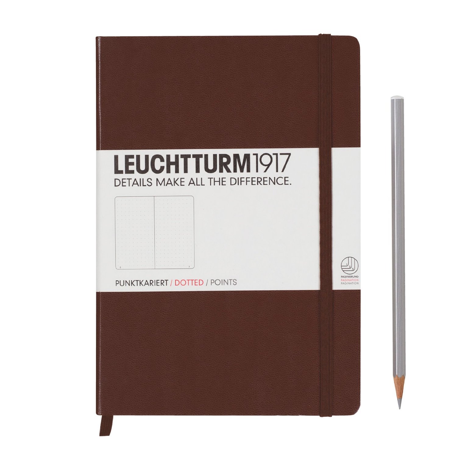
Comments
Post a Comment